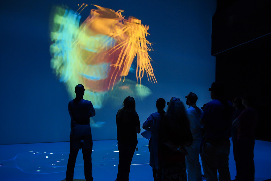
A human adult’s heart beats over 100,000 times a day, more than 3 million times over a person’s life. So there are a lot of good reasons to take a closer look at how this organic pump works. And a great way to do it is the 3-D visualization of the human heart that MEVIS has specially developed for “The Universe Within” at Deep Space 8K in the Ars Electronica Center. Basis for this virtual anatomy hall offers a Deep Space 8K platform, that was specially developed by the Ars Electronica Futurelab.
Spectators can observe from a variety of perspectives how blood flows through the body’s veins and arteries. So-called slice images captured by a computer tomography (CT) scanner are used to produce a three-dimensional motion picture of a pumping heart. Thanks to actual medical data derived from magnetic resonance (MR) tomography, the visualization delivers a highly realistic representation of the speed of the blood flow and the distribution of pressure inside the heart. We recently had an opportunity to talk with MEVIS’ Mathias Neugebauer about how visualizations will be used in medicine in the future to avoid subjecting patients to invasive procedures.
The depiction of blood flows through the heart is a spinoff of simulations in wind tunnel experiments. What actually led to seeking answers far afield from the purview of your area of expertise?
Mathias Neugebauer: Often, visualizations are oriented on facts & circumstances and visual stimuli that we’re accustomed to in everyday life. This ranges from the selection of colors—for instance, red for danger or caution—all the way to complex forms and pictograms like using arrows to point out the direction of movement. Having recourse to common knowledge and familiar experiences enables the spectator to concentrate on the actual information being presented without having to learn a new graphic vocabulary in advance.
Our engineers used what were originally flow visualizations of an aircraft’s aerodynamic drag as simulated on a computer. So, that gave us the idea of taking elements like fabric streamers and smoke trails that we were familiar with from wind tunnel experiments and imitating them in the digital portrayals. When flow visualizations came into use in the field of medicine, previously established visualization techniques like streamlines were adopted too. On the other hand, in special cases like the depiction of flows in ultrasound images, we have recourse to the visual imagery that was already established in that field—for example, blood flowing towards the sonic head [transducer] is depicted as red and blood flowing away from it is colored blue. Which visualization technique is best suited ultimately depends on the area of application of the images produced thereby.

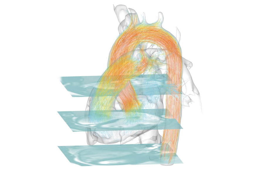
Visualisation of the blood flow inside the heart, Credit: Fraunhofer MEVIS
What, in your opinion, is the most difficult aspect of visualizing how the human body functions?
Mathias Neugebauer: Many of the body’s functions entail the interplay of several processes, which is why it’s not enough to individually depict a process like the blood flow in the heart. For it to be correctly interpreted, contextual information like the form and condition of the coronary blood vessels has to be presented too. This can result in the context and the actual information being spatially overlaid. In order to prevent this visual overload, various visualization & filtration methods are applied. The aim is to provide for unobstructed examination of the desired information while still enabling the context to remain present to an extent that allows the information to be interpreted correctly. In visualizing the heart, we’ve depicted only the larger coronary blood vessels (filtering) and employed a technique that combines sheer transparency with highlighting structures’ edges (visualization).
“Key variables in the creation of an informative visualization are the choice of technique and the decision on which information is to be filtered out.”
Here, the essential determinants are not only the data to be depicted but also what sort of viewers will be interpreting them. Accordingly, a visualization meant to brief a patient on his current condition should be designed more generally and be supplemented with additional context, whereas a visualization that supports a physician in making her diagnosis should be limited to the essential information to avoid distractions. Generally speaking, when it comes to conceiving a visualization, it’s always important to know your audience and their visual vocabulary.

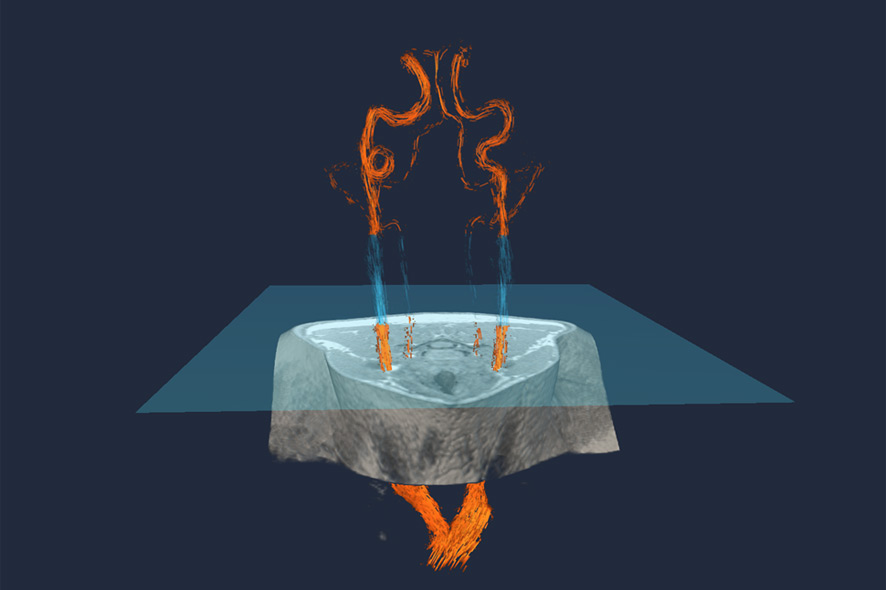
Arterial blood vessels in the neck (orange and blue). A specific MR imaging method, Arterial Spin Labeling (ASL), produces spin in the magnetic moments in a specific layer (blue square). This magnetic turn by 180 degrees labels the blood that passes through the layer. Credit: Fraunhofer MEVIS
People create images in order to better understand themselves. What are the pros and, perhaps, cons of using images in medicine?
Mathias Neugebauer: Human beings are very visually oriented. A picture evokes a reaction in people in a very direct way. If the visualization is well designed, it provides direct access to insights so that the viewer can intuitively comprehend complex interrelationships. This is a major benefit especially in the case of medical visualizations since they often have to get across multiple processes or contextualized information such as turbulence of the blood flow in connection with the form of a blood vessel.
“However, there’s also a danger inherent in this intuitive interpretation of images. People tend to quickly trust information depicted in images. That’s why it’s important for the viewer to have a fundamental understanding of how the visualization was generated.”
If a segment of a blood vessel isn’t displayed, then that might be due to any number of reasons: it wasn’t coated with contrast medium during the imaging process; it wasn’t correctly recognized as a blood vessel during the segmentation; it wasn’t meant to be depicted due to the filtering; or it’s not visible due to the selected visualization technique. When a viewer considers the image thus produced, what’s actually the most likely interpretation—that it’s not there—isn’t the correct one.
Therefore, a physician who’s basing his diagnosis on images has to know how these pictures came about and how precise the depicted information is. A good visualization system supports the observer by marking uncertain areas or making them appear paler and providing access to additional image sources in order to resolve ambiguities.
Another example from another field of research has to do with ambiguous visualizations of networks of nerve fibers in the brain. An indistinct area of uncertainty is displayed around the nerve pathways derived from the visual data. Due to a degree of imprecision in the image data, there’s a certain probability that nerve pathways run through these areas as well. This additional information helps the surgeon plan the removal of a tumor in such a way that no nerve fibers are damaged, if possible.

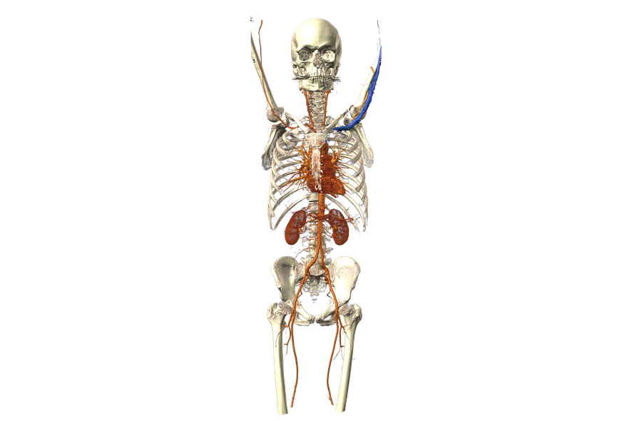
Human skeleton and arterial vascular system. For this special type of X-ray imaging, called angiography, doctors need to inject their patients with a contrast agent. Contrast agents absorb the radiation from the CT scanner and make blood visible in the vessels. Credit: Fraunhofer MEVIS
You’re currently working on two more visualizations for “The Universe Within,” and they’ll soon be running in Deep Space 8K at the Ars Electronica Center. Tell us about them.
Mathias Neugebauer: The first is based on a whole-body CT, a computer tomographic data set capturing the entire body. The point is to show how the segmentation methods developed at Fraunhofer MEVIS help to differentiate between bones and organs. In a CT, contrast-enhanced blood vessels and bones appear identical with respect to color. If blood vessels run immediately adjacent to bones like in the cervical vertebrae, it’s difficult or even impossible to reach conclusions about the condition of these blood vessels. But following segmentation, a differentiated diagnosis is possible.
In the second visualization, we want to demonstrate how a special configuration of the magnetic fields in an MR scanner makes it possible to perform so-called arterial spin labeling (ASL)—magnetically marking blood and making it possible to see its distribution in the various areas of the brain. This can be applied in stroke diagnosis. If no magnetized blood flows to particular areas of the brain, the MR image of it remains dark and it’s apparent that targeted stroke therapy has to be initiated. This saves time and money in connection with administering the contrast medium.
ATTENTION: On Saturday & Sunday, November 14-15, 2015 from 10 AM to 6 PM both days, the Ars Electronica Center is hosting a Deep Space Weekend with visualizations and speeches (in German language) focusing on The Universe Within. The two new visualizations by Fraunhofer MEVIS will soon be available in Deep Space 8K.

Mathias Neugebauer studied computer visualization at Otto von Guericke University in Magdeburg, Germany from 2001 to 2007. He first worked in the field of medical visualization at AG Visualisierung in conjunction with research for this master’s thesis. His doctoral dissertation, which he completed while working as a member of the scholarly staff at AG Visualisierung (2007-14), dealt with interactive exploration of complex blood flow visualizations in the brain. Since 2014, he has worked at Fraunhofer MEVIS, where his areas of investigation include computer-supported diagnosis and therapy of congenital constrictions of the aorta.
