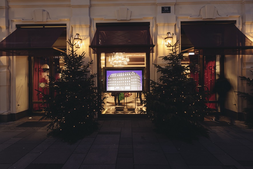
More than 1,400 hours of work went into the House of Sacher—the paper version alone! Two masters of paper-based art, Daniela Leitner and Sandra Reichl, worked with Ars Electronica Solutions to craft a fascinating diorama for the showcases of Vienna’s newly-renovated Café Sacher Eck.
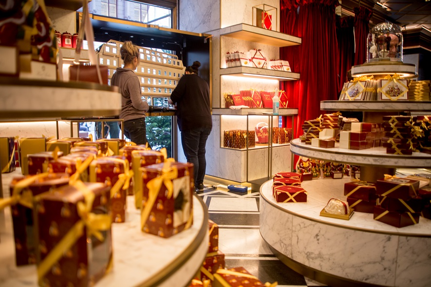
One of the three projects Ars Electronica Solutions installed at Sacher Eck is a series of lavishly detailed showcases designed to enthrall both pedestrians strolling by outside and sweet-toothed diners about to enjoy one of Sacher’s world-famous tortes. The House of Sacher in paper form, lovingly hand-crafted over countless hours and complemented by Ars Electronica’s animated sequences, tells the story of hospitality and gastronomy provided Sacher style. And an interactive interface lets users share their own Sacher Moment, and to see it actually portrayed in the diorama.
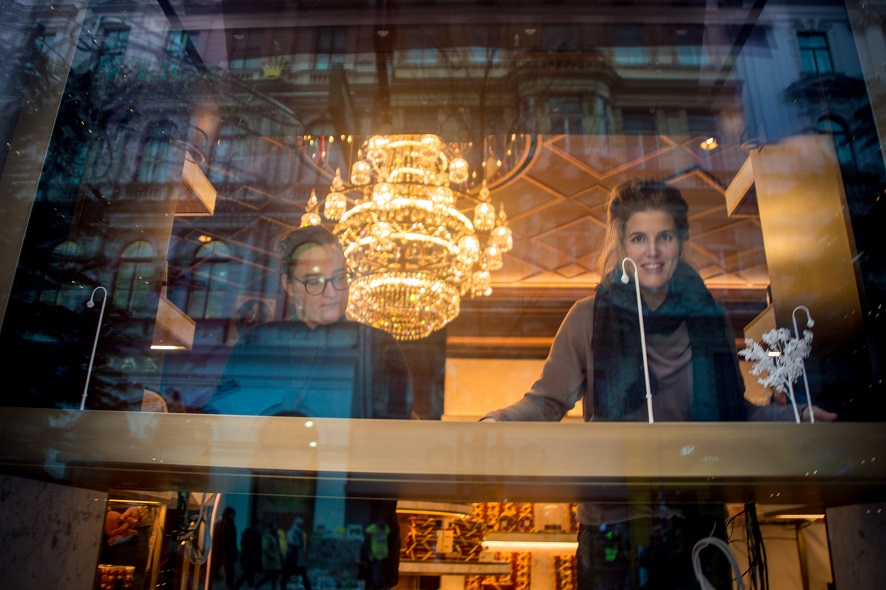
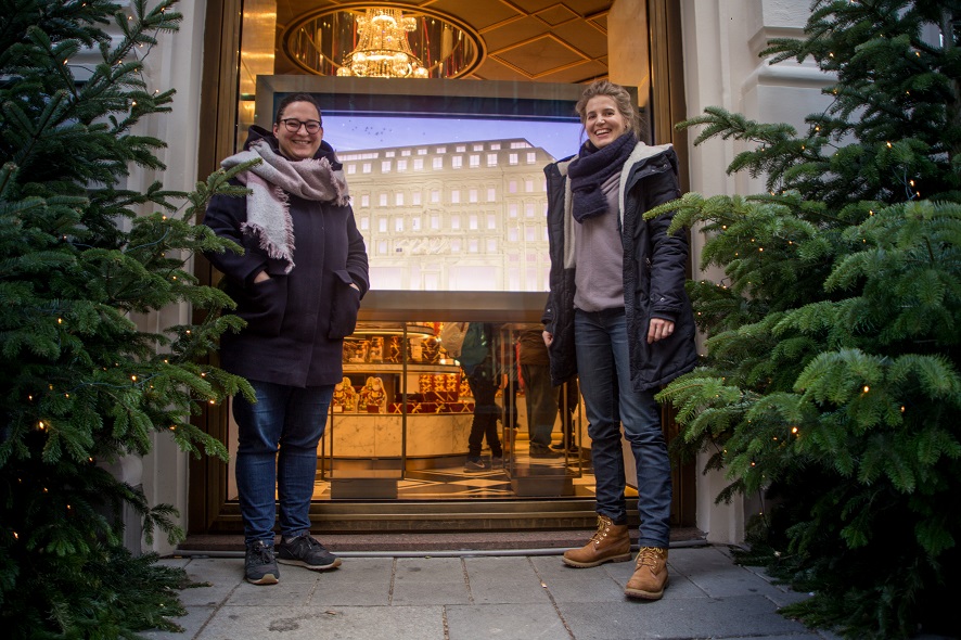
Appropriately, Sacher, the traditional Viennese landmark, was the setting of our recent meeting with Daniela Leitner and Sandra Reichl, who told us about their diorama, the challenges it entailed, and their love of work at the interface of analog and digital.
Credit: Vanessa Graf
The two of you collaborated on the Sacher diorama. What preparations go into such a project?
Sandra Reichl: The first step is deconstructing the architecture, visually speaking. Much observation, and above all reading the blueprints—though I must say, the blueprints looked totally different than the actual house.
Daniela Leitner: For example, the windows had to be a certain size in order to accommodate Ars Electronica’s animated sequences, which is why we removed an entire floor from the Sacher building. The House of Sacher would have actually had many more floors! It’s divided into three parts, and we’ve removed windows from each one. But optically, it’s still the House of Sacher.
Sandra Reichl: The challenge was to combine realism with the size ratios so that the building’s proportions are accurate. If we had created a scale model, then the windows would have been too small any you wouldn’t be able to see the animation sequences. Thus, the essence of the design process was to actually come up with a building that has big windows but nevertheless is totally recognizable as the House of Sacher. Moreover, it wasn’t meant to be a just a realistic copy; it has perspective, or at least comes across as being in perspective. The preparation process is thus a mixture of analyzing the architecture, considering the blueprints, doing a lot of observation and photography, and then optimizing so that the design is still charming in its own right without looking like it’s been cropped.
Now, tell us about the next phase, the construction process.
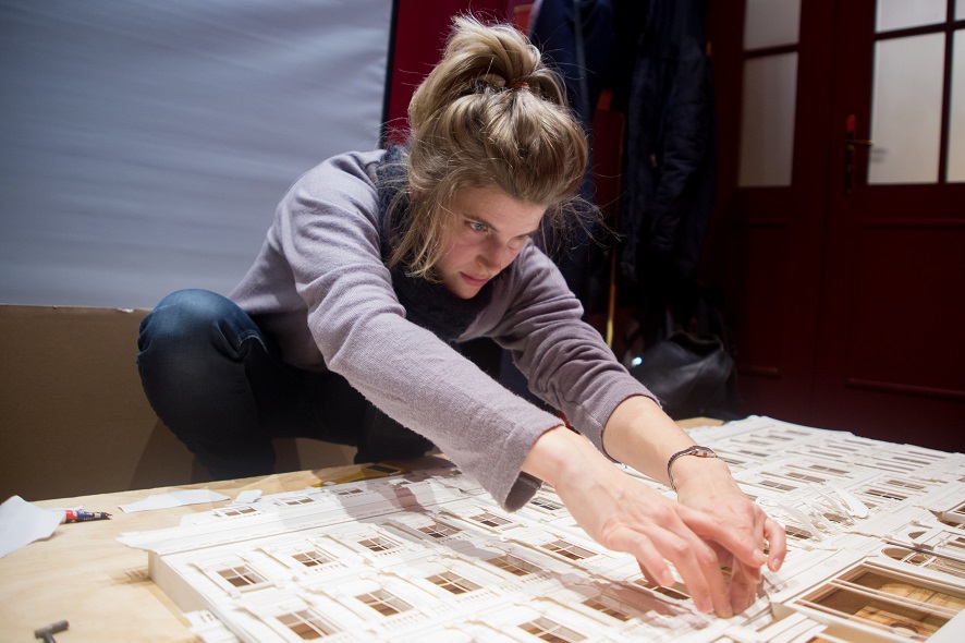
Daniela Leitner: For at least a month, the work was strictly digital. On some of our other projects, we work only in analog mode using sketches and scalpels, but because the windows had to be redone so many times and this entailed so much detail work, we first drew the whole building in vectors. It was only after a month of this—or maybe 5-6 weeks—that we went into production. The prep work was extensive and very complex since there were so many layers. For each window, there must have been…
Sandra Reichl: …between 20 and 30 layers. The process was initially to draw the building by hand, then to digitize the drawing, convert it into vectors, then more or less via perspective to make sure that absolutely all the windows worked, then to explode this and, finally, to produce all the individual parts with a laser cutter. These were then arranged and sculpted—that is, formed. Keep in mind, the construction not only has flat components but also structure—for instance, when you look at the flags, you can see the true extent of Daniela’s talent. That was really hard work. I believe there are 15 different windows, each of which repeats 4-6 times, so a total of at least 75 windows! We built all of them, assembled all the individual parts.
Daniela Leitner: We call it our Sacher Summer. [laughs]
Sandra Reichl: Summer, autumn and winter! It wasn’t until all the individual components were done that we built the basic structure, and everything else was serially built onto it.
Credit: Vanessa Graf
How was it for you—working with a world-famous, traditional firm like Sacher ?
Sandra Reichl: It’s wonderful to have worked with a landmark like Sacher. I’m sure any Austrian designer would be absolutely delighted to have this opportunity. I think it’s marvelous to work with Austria’s biggest, oldest established brands. And our impression during installation was that Sacher’s people were nice and very supportive.
I also find that the technological and analog elements dovetail nicely. It’s a lovely mix, but, to tell you the truth, it was also a challenge. It seems so simple to just set up an analog component in front of a video monitor and it works perfectly. In fact, it was over the course of the process itself that we became aware of many of the fine points—for instance, that the coloration of the sky is extremely important, that it shouldn’t clash with the building or the color of the paper. We had to intensively reconsider how we really wanted to configure the day & night skies. The clouds couldn’t be overpowering, and the blue not too dark; otherwise, the white building would be much too bright. It was an interesting process of realization that this isn’t so easy. It was a challenge to match and adjust everything so it doesn’t appear to be an analog portion grafted onto a digital portion, but rather that it all works as a well-integrated entity.
Credit: Vanessa Graf
Daniela Leitner: And then we had to tweak the design of the figures a bit more in the direction of the building itself, because the original look came across as too strange. When we brought everything together, the contrast was too striking.
Sandra Reichl: The figures had initially been done in comic-book style, which clashed with the realism of the building, and vice versa. Now, the figures—both their proportions and their body language—are a bit more realistic. This is what I mean when I say homogeneous. You can simply put two elements together and wait and see if that works, or, over the course of the repeated steps of creation and evaluation, you can assess how it can possibly be made more homogeneous so that it really looks as if all the elements are part of one world.
Credit: Vanessa Graf
What exactly is it that fascinates you about working at the interface of analog and digital?
Daniela Leitner: That people never know what is the result of analog work and what was done digitally! It remains a bit mystical. Where can you derive charm from the analog, and where can you benefit from digital efficiency? In this way, you’re proffering a product that’s simply enchanting.
Sandra Reichl: I believe this is something you just feel. A 100% digital project or product can never be as charming as one that imparts the feeling of having been handmade with blood, sweat and tears. Now that we’ve come so far technologically, it’s even more wonderful to be capable of bringing the digital back into the real world. This doesn’t only have to do with analog elements; it’s also a matter of how we interact with technology. To what extent do we permit ourselves to be formed by it? In my view, design should never be determined by technology, which should never be more than a tool.
Daniela Leitner: I’m all for it when something like a 3-D scanner is developed that makes it possible to digitize an analog object and process it further. Using digital technology to counterfeit an analog object takes a lot more effort than making that thing by hand anyway. I want to stay up-to-date, but in combination with analog crafting. I like to utilize technology to create this charm, to the maximum extent that this is possible…
Sandra Reichl: … and simply to tell good stories. What is charm? Good stories. I believe that the diorama provides an excellent account of the history of Sacher together with the animated sequences. The screen on its own could never have gotten this story across in such charming fashion, and the same can be said for the building on its own. The combination of the two is what makes this such a well-told narrative.

Daniela Leitner is a freelance art director, director and illustrator. She collaborates with Salon Alpin, complementing the animation studio’s art department with the requisite skills for animated and interdisciplinary handmade projects. Daniela wrote, directed and designed “Nachsaison”, a short animated film that premiered in April 2017. Since then, it’s been screened at prestigious film festivals worldwide and has won several awards both in Austria and abroad.

Sandra Reichl works at the nexus of art direction and design production with a strong focus on brand identity, branding and the development of visual worlds. After graduating from Linz Technical School for Communication Design, she studied graphic art and advertising at the University of Applied Arts Vienna under the tutelage of Professor Walter Lürzer, and then spent several years working at top-name Austrian ad agencies. She went out on her own in 2010. Having completed projects in Stockholm, Berlin and New York and won numerous national and international awards, Reichl returned to Vienna, where she works as a freelancer designer together with various creative teams and artists (WOW CREATIVES) for agencies and brands.
The papercraft diorama by designers Daniela Leitner and Sandra Reichl as well as two other projects created especially for Sacher by Ars Electronica Solutions are now on display in interior & exterior showcases at Café Sacher Eck, Philharmonikerstraße 4, Vienna, Austria.
To learn more about Ars Electronica, follow us on Facebook, Twitter, Instagram et al., subscribe to our newsletter, and check us out online at https://ars.electronica.art/news/en/.
