The Ars Electronica Futurelab, in collaboration with Toyota Coniq Alpha in Japan, is envisioning “Data Art & Science,” a new interdisciplinary field that incorporates artistic perspectives on future transformations based on data science.
In this project, Ars Electronica Futurelab collaborates with artists and data scientists to prototype projects that embody Data Art & Science using the Ars Electronica Center’s immersive environment, the Deep Space 8K. The commissioned works of this first program explore the different relationships of data with the individual, the citizens, the society and the planet, addressing topics like mental state, health care and economy relations, air pollution and mobility, loss of biodiversity and climate change.
Ars Electronica Futurelab:
Project lead: Kyoko Kunoh
Research Lead: Maria Pfeifer
Artistic direction: Nicolas Naveau, Hideaki Ogawa
Program
Introduction by Ars Electronica Futurelab (AT)
Data & Human
-
one who suffers by Quadrature (DE)
一寸 Issun by Akiko Nakayama (JP)
23 nm by Peter Holzkorn, Arno Deutschbauer, Ars Electronica Futurelab (AT)
Data & Planet
Artworks Data & Human
one who suffers
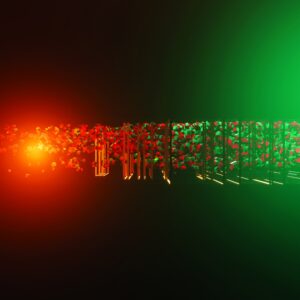
Quadrature (DE)
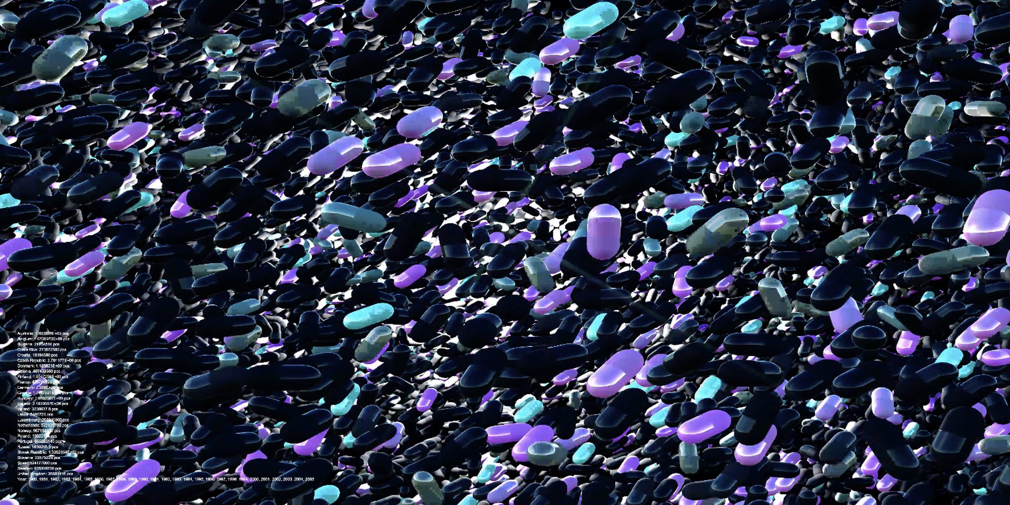
image: Quadrature
The audiovisual project intrinsically weaves together data on drug consumption, pharmaceutical revenues and health care spendings with statistics on waiting times and perceived personal health based on income.
By juxtaposing pharmaceutical industry data with global health statistics one who suffers seeks to confront the audience with paradoxes of the modern healthcare landscape. Driven by raw data, a turmoil of sound is synchronized with abstract graphics and stroboscopic effects, creating a synaesthetic experience that assaults the senses – a visceral commentary on the incongruity between financial interests and human well-being.
Datasets:
Health Care System (all available OECD data from all available countries)
Chapter 1:
- Waiting times for operations (https://stats.oecd.org/ Health > Healthcare Utilisation > Waiting Times)
Chapter 2:
- Perceived status by socio-economic status – Good/very good health, income quintile 1 (lowest) compared to income quintile 5 (highest) (https://stats.oecd.org/ Health > Health Status > Perceived health status by socio-economic status)
- Health expenditure and financing – all providers – per capita, current prices, current PPPs (Purchasing Power Parity) (https://stats.oecd.org/ Health > Health expenditure and financing)
Chapter 3:
- Pharmaceutical consumption – defined daily dosage per 1000 inhabitants per day (https://stats.oecd.org/ Health > Pharmaceutical consumption)
- Pharmaceutical sales – Million US at exchange rate 8 (https://stats.oecd.org/ Health > Pharmaceutical sales)
Legend:
1. Chapter: Health Care Utilisation
Waiting times of patients for operations in mean days, sorted by year by country Visual: waiting time / year / country as loading bar, all countries per year at once Sound: duration of waiting time
2. Chapter: Health Status & expenditure
A) Perceived health status by socio-economic status, sorted by year by country Variable: Good/very good health, total aged 15+, Income quintile 1 (lowest) AND
Variable: Good/very good health, total aged 15+, Income quintile 5 (highest) Measure: % of population
Visual:
- Quintile 1 compared to Quintile 5 as white bars on pill
- ratio between Quintile 1 and Quintile 5 defines tilt of pills
Sound:
- white noise filtered depending on perceived health (Quintile 5 high value > high sound, Quintile 1 perceives very good health > low sounds)
- sine wave repeating same pattern
B) Health expenditure and financing, sorted by year by country:
Financing scheme: All financing schemes Function: Current expenditure on health (all functions) Health Care Provider: All providers Measure: Per capita, current prices, current PPPs Visual: amount of expenditure defines amount of pills Sound: expenditure defines gain (volume)
3. Chapter: Pharmaceutical Market A) Pharmaceutical consumption, all available drugs, per year per country Measure – Defined daily dosage per 1000 inhabitants per day
Visual:
- type of drug defines colour of pill
- all consumed pills (defined daily dosage) stay visible – ending with all consumed pills of all available drugs in all available countries over the years Auditive representation: one defined tone per country
B) Total Pharmaceutical sales, per year per country Measure: Million US at exchange rate Visual: number of sales defines rhythm/visibility Sound: expenditure defines gain (volume) and reverb
Issun
Akiko Nakayama (JP)
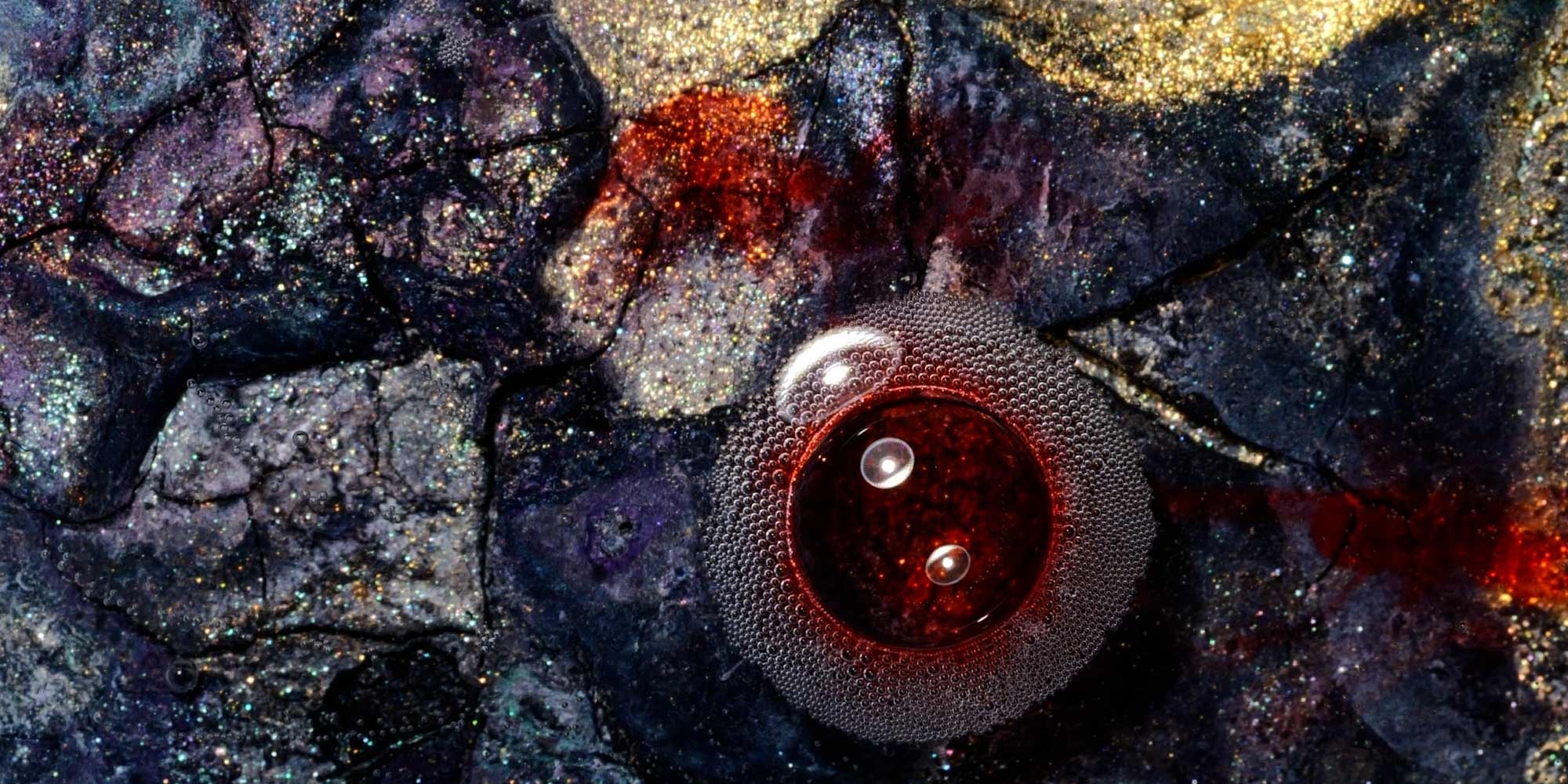
photo: Akiko Nakayama
“Issun”, in Japanese, represents a unit for measuring length about 3.03cm. It means smallness and fragility. The word originally comes from width of the thumb. In Japan, there is a story about the adventure of a little boy called ‘Issun-boshi,'(comparable to Tom Thumb from English folklore). It is a hint to see and measure our world using our body as a unit. Furthermore, it refers to the feeling of smallness and fragility in the world. This work investigates the gap between individual optimism and social pessimism when looking on our future. The information indicated by data on optimism and pessimism and the individual experiences in everyday life, create the tension field that Nakayama explores with her genuine artistic expression.
Dataset:
Our World in Data: Optimism & Pessimism, https://ourworldindata.org/optimism-and-pessimism
Artist Statement: “First, I visited the “Our World in Data” website and realized that there was a difference between my personal experience and the world represented by the data. We are optimistic or pessimistic about the future, depending on how far the topic is from a personal area. And those biases change behaviour and change the future.
Before diving into the data and painting, I started moving my body, creating physical phenomena as a painter, and then aiming to discover some properties/characteristics. The bubbles in the painting will always break. However, bubbles also appear in our daily life as circles.
While observing elements from the chaos, If I find something in my work that “is an irreplaceable individual, yet also has universality in the multitude.” I think it can, regardless of the specific topic, become “My personal story and the story of all of us,” living beside optimistic/pessimistic perspectives together.”
Legend:
“I didn’t directly connect data with visuals, so extracting the elements from reality was crucial. One day, my friend made jelly and sent me a photo of how lovely it was. The shapes of the bubbles that emerged in the thickening were stable and suitable to observe. I was convinced that it would be fit for this project.
The collaboration with Mika. She usually has a more powerful touch while playing piano, but the song was so gentle, and she told me a beautiful secret: She played the piano in the morning, and her husband was still asleep then, so the melody was subconsciously gentle. The tone contains information about the relationship between her and her love.
When I started working with data, I noticed that I was somewhere in the graph and trying to separate myself into pieces #tags of information. But, in this work, we mixed several aspects of ourselves, such as ” Akiko the painter / Akiko talking about jelly with a friend” and “Mika the pianist / Mika in her life with her partner.”. In the artwork, some figures are created by interacting with several things, such as the borderline created by the contrasting spread of two different types of paint and the relationship of gravity. In this way, I thought it was important for the visuals to express information that the natures are related to each other.”
Credits:
Piano: Mika Kawada
23 nm
Peter Holzkorn, Arno Deutschbauer, Ars Electronica Futurelab (AT)
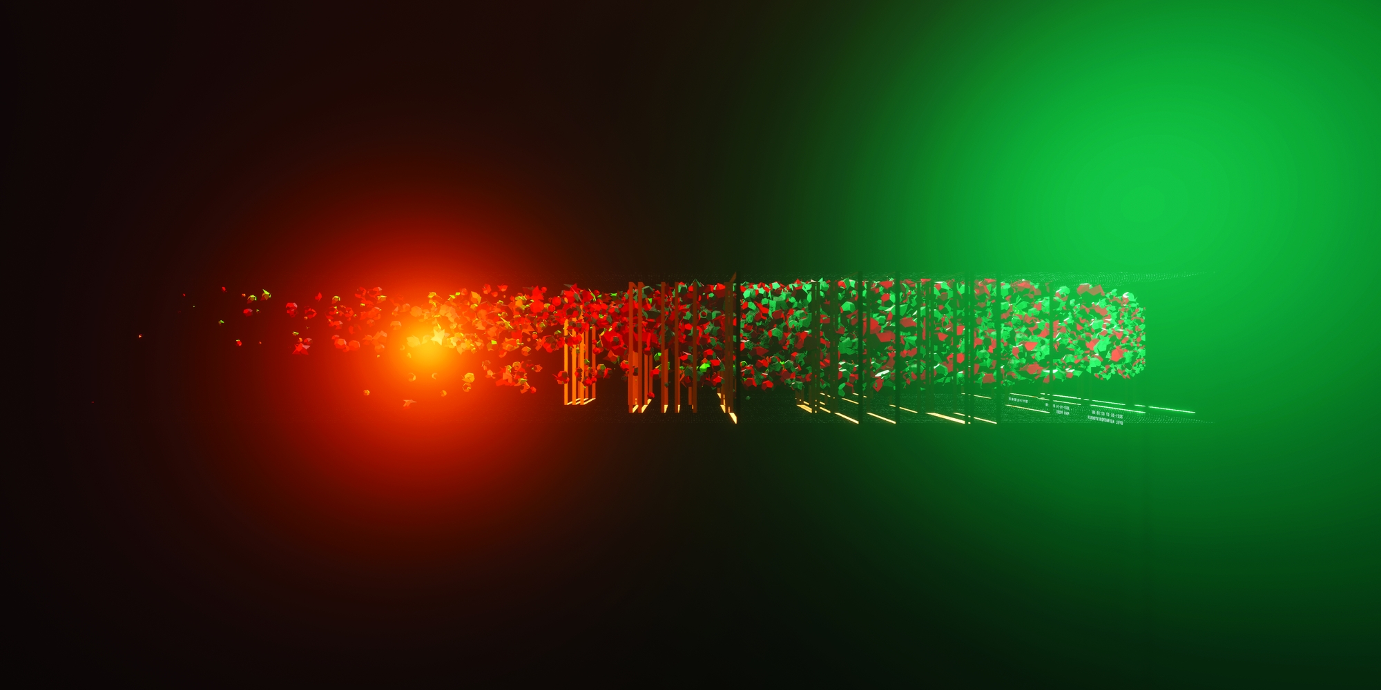
image: Peter Holzkorn
23nm is a magnifying look at how we can gather data about the minute and microscopic matter we manufacture with our mobility. Though practically invisible, nanoparticles impact our bodies in critical ways. Measurements taken in real city-traffic situations envelop the viewer as swarms of particular structures, transferring mass and volume to shape, form and colour. What if we knew the quality of the air we breathe so clearly everywhere, all the time? What if such measurements were as ubiquitous as traffic data, and could become, like distance, speed and stress, integral in the thoughts of our collective navigation systems?
What kind of “planet care” could we provide, if all citizens had innovative mobile sensors to monitor the environment we live in?
Dataset:
TU Graz, Institute of Electronica Sensor Systems: Project CARES (City Air Remote Emission Sensing)
Part 1: stations: Emission data from measuring stations in Prague, Brno, Krakow, Milano gathered over several days in 2021 and 2022.
Part2: chasing: Emission data from “plume chasing”, vehicles with measuring devices following other vehicles in city traffic in the Czech Republic in 2022.
Legend:
Part 1: stations
- Scene time is linearly mapped to the progression through the time of day, so that a full day is contained in the time for which the scene is visible
- Each measuring station becomes a visual tunnel, laid out next to each other; in a tunnel’s confines, data points from a particular day at the station are triggered as the time passes; each data point causes an event that
a) is marked by a frame that moves down the tunnel b) is annotated with anonymized vehicle data of the emission source c) triggers a burst of particle births in proportion to the concentration of nanoparticles in the vehicle exhaust
Part 2: chasing
- Geolocation- and timestamped exhaust data from several days is visualized in scene space
- The chasing sequences are built up after each other, in linear time with respect to data point index
- For each n-th data point, a particle is spawned that grows over time based on the concentration of nanoparticles in the vehicle exhaust
Both parts look specifically at nanoparticles from 23nm (smallest size that can be reliably measured with current instruments) to 300nm contained in vehicle exhaust.
Credits:
Emission Data: Alexander Bergmann, Markus Knoll; Graz University of Technology Institute of Electrical Measurement and Sensor Systems Denis Pöhler; Airyx GmbH Ake Sjödin; Swedish Environmental Research Institute Project: CARES – City Air Remote Emission Sensing
City Map Data: © Mapbox, © OpenStreetMaps
Artworks Data & Planet
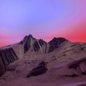
MOTHER FLUCTUATION
Akira Wakita (JP)
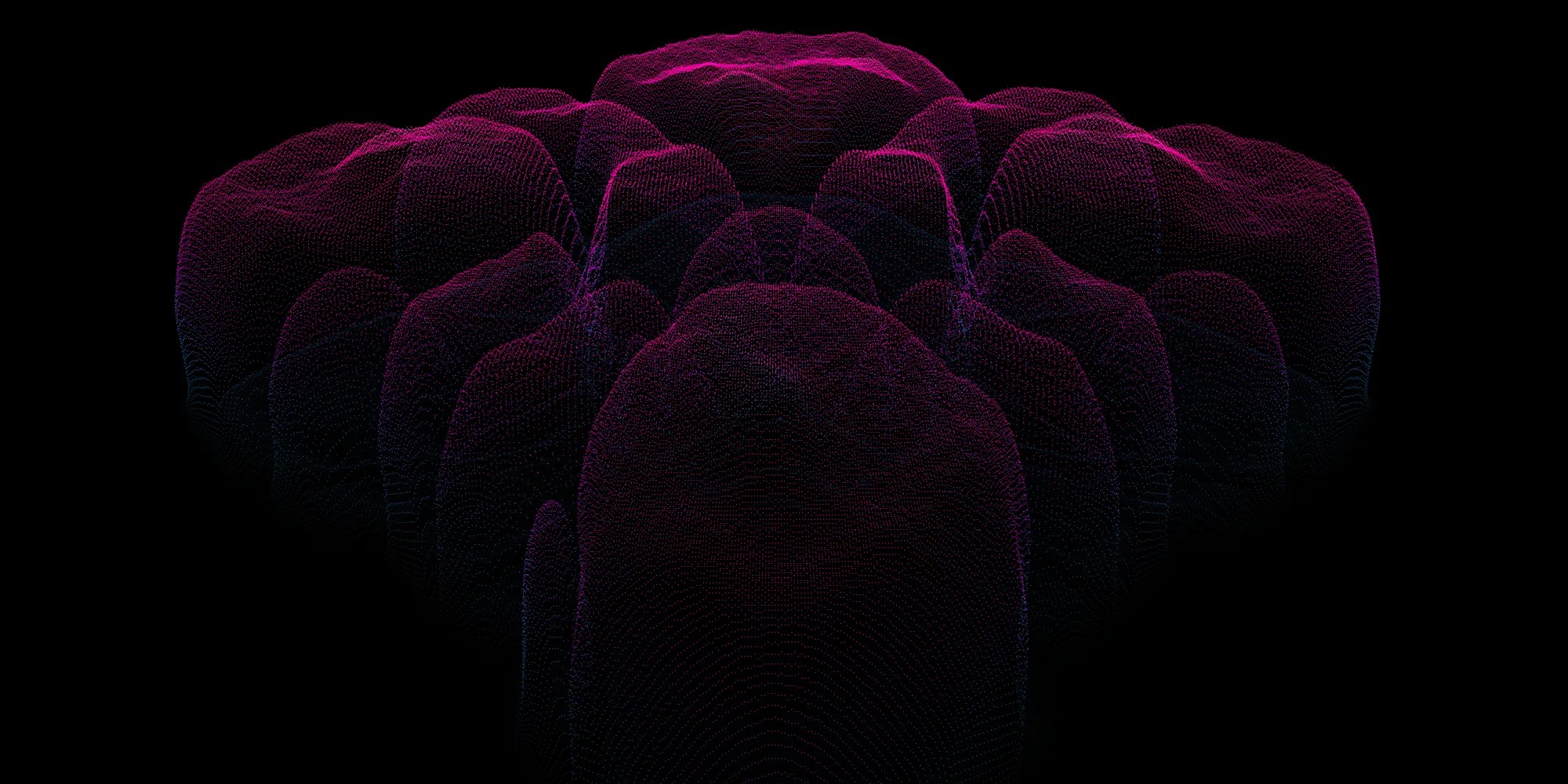
photo: Akira Wakita
This work aims to express the impact of climate change from an artistic standpoint while using scientific data. Through multiple scenes, the work focuses on the phenomenon of fluctuation (rise and fall) of temperature, sea level altitude, markets, and civilization, and depicts Mother Earth, which is indifferent to human activity. Referencing the expression of traditional Japanese hell painting (Jigoku-e), the work renders landscapes that reminds us of the catastrophe that global warming will bring to mankind by manipulating open scientific data in an art-specific manner. The team aimed to create an immersive visual and acoustic space with 8K video and 5.1ch stereoscopic sound.
Datasets:
Glacier text: IPCC (The Intergovernmental Panel on Climate Change) Ocean tide: OFES (Ocean General Circulation Model for the Earth Simulator) dataset by JAMSTEC
Legend:
- Regarding the IPCC report, the artist decided to use the text itself as a graphics element.
- By applying fluid simulation to a uniformly displayed string of text, the team aimed to achieve complex text animation and provide an emotional experience for the viewer.
- For example, the words “Capitalism” and “Temperature” rise, thereby melting the glaciers in the string.
- The other data, the OFES dataset, is ocean current data simulated by a supercomputer. The team extracted the flow of the ocean near Japan and realized a large-scale visualization in 8K.
- In all scenes, the visualization was smartly done in a scientifically correct manner at first, but gradually, creative deviations were made in the data, parameters were extended to improbable levels, and errors in the simulation were converted directly into the representation.
- The team mixed scenes based on original physical/chemical mathematical models with scenes based on data.
Credits:
Artist: Akira Wakita Software: Yuki Kuwashima, Yuta Morofuji Sound: Kairi Haruna Research: Yoshinori Shibahara, Kazuki Nagata, Taisho Nishihara Technical support: ASTRODESIGN INC., Masaki Yamabe
Harmony Lost
Arno Deutschbauer, Ars Electronica Futurelab (AT)

image: Ars Electronica Futurelab
The loss of biodiversity is one of the deep issues our planet is facing right now. The decline of the local field and meadow bird population is a tangible example of this problem. For individual species, declines of as much as -80% or more are evident. High intensity agriculture and land use are the main factors that determine this situation. Harmony lost uses auditive data (voice recordings of birds) that is paired with the data of bird population decline to create an immersive audiovisual experience. The acoustic piece is created from the sound of the whinchat (Saxicola rubetra), a bird that was very common but now faces extinction. When the bird is gone, its song will have disappeared from the earth. Its voice will vanish and only be part of art.
To help, you can join several projects run by BirdLife and other initiatives: from active personal involvement in citizen science projects like bird monitoring, to supporting habitat protection measures like conservation projects, where areas of biodiversity are purchased with donations.
Datasets:
BirdLife FBI – Farmland Bird Index represents the population situation of birds in the agricultural landscape (especially arable land, grassland, fruit growing, viticulture) Xeno-Canto, an open archive of natural heritage audio, collecting recordings of wildlife sounds.
Legend:
Sound:
- For the sound experience, original Whinchat and harvester recordings were used to create the auditive narrative.
- Digital archives of bird songs already showcase songs of birds that have already grown extinct – and will even more do in the in the future, thus forming a natural heritage one can turn to, when the world falls silent.
- The composition follows a data driven score that reacts to the decline in population numbers with the polyphonic amount and dynamic.
- The decreased whinchat population of the used data set shows off in the decreasing amount of bird recordings within the auditive experience.
- The sounds were deformed by modular system components to simulate the process of increasing disappearance of the bird population through technology
Visual:
- The Whinchat was chosen as representative species of birds which according to BirdLife reports an acutely endangered bird species in the upper Austrian rural area.
- Light effects are directly related to the audio data.
- By deforming and displacing RGB values from an actual whinchat photography, the bird becomes a digital metaphor for an agricultural landscape.
Credits
Ars Electronica Futurelab: Arno Deutschbauer, Peter Holzkorn, Kyoko Kunoh, Otto Naderer, Nicolas Naveau, Hideaki Ogawa, Maria Pfeifer
PARTNER: Toyota Coniq Alpha
Deep Space 8K Program Collaborators: Akiko Nakayama, Quadrature, Akira Wakita
Related Projects
Immerse yourself in our work
Interested in similar projects? The following Ars Electronica Futurelab projects are related to the ideas and concepts presented here. An overview of all our productions, cooperations and projects can be found in our project archive.